MCSS
MCSS(Multilayer CSS) OOCSSとBEM
- BEMでいうところのBlockとそのElementとModifierはまとめて同じ場所に記述されるべき。
- 可能な限りクラス名を略称にする
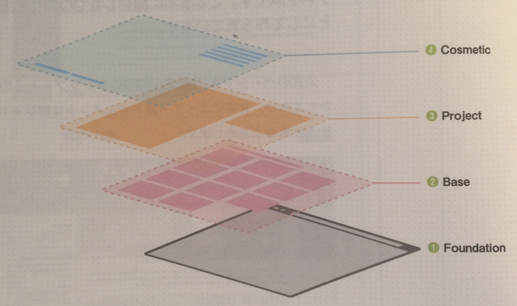
1.Foundation
SMACSSでいうところのBase
2.Base
SMACSSでいうところのModule
下層のレイヤーからの上書きを禁止することによって、レイヤーの混同とそれによる複雑化、破綻のリスクを抑える
3.Project
Baseレイヤーコンポーネントよりも具体的なページを構成する要素。登録フォーム、ログインエリアのブロック、コメントリストのような要素
4.Cosmetic
下層のレイヤーコンポーネントには含まれないような、ちょっとしたスタイルが含まれる。リンクカラー、少数のプロパティで構成されるCSSクラス(.font-sizeXL .margin-tL)、グローバルなModifier
- Cosmeticレイヤー自身も含め、例外のコンテキストレイヤー以外のレイヤーから上書きできない。
Context 特定のブラウザやデバイス向け、またはログイン中の時にメディアクエリによる特定条件化にある場合などに、例外的なスタイルを用意するためのレイヤー
Reference from
http://operatino.github.io/MCSS/

Web制作者のためのCSS設計の教科書 モダンWeb開発に欠かせない「修正しやすいCSS」の設計手法 Web制作者のための教科書シリーズ
- 作者: 谷拓樹
- 出版社/メーカー: インプレス
- 発売日: 2014/07/24
- メディア: Kindle版
- この商品を含むブログ (1件) を見る
Difference between mixins, extend and %placeholder
Mixins
A mixin lets you make groups of CSS declarations that you want to reuse throughout your site.
@mixin message($color) {
  border: 1px solid #ccc;
  padding: 10px;
  color: $color;
}

.success {
  @include message(#333);
  border-color: green;
}

.error {
  @include message(#333);
  border-color: red;
}
.success {
  border: 1px solid #ccc;
  padding: 10px;
  color: #333;
  border-color: green;
}

.error {
  border: 1px solid #ccc;
  padding: 10px;
  color: #333;
  border-color: red;
}
Extend/Inheritance
Using @extend lets you share a set of CSS properties from one selector to another. It helps keep your Sass very DRY.
.message {
  border: 1px solid #ccc;
  padding: 10px;
  color: #333;
}

.success {
  @extend .message;
  border-color: green;
}

.error {
  @extend .message;
  border-color: red;
}
.message, .success, .error, .warning {
  border: 1px solid #cccccc;
  padding: 10px;
  color: #333;
}

.success {
  border-color: green;
}

.error {
  border-color: red;
}
%placeholder
Placeholder selectors have the additional property that they will not show up in the generated CSS, only the selectors that extend them will be included in the output.
%message {
  border: 1px solid #ccc;
  padding: 10px;
  color: #333;
}

.success {
  @extend %message;
  border-color: green;
}

.error {
  @extend %message;
  border-color: red;
}
.success, .error{
  border: 1px solid #cccccc;
  padding: 10px;
  color: #333;
}

.success {
  border-color: green;
}

.error {
  border-color: red;
}
Difference between mixins, extend and %placeholder
- difference between mixins and extend
# mixin
+.success {
+  border: 1px solid #ccc;
+  padding: 10px;
+  color: #333;
+  border-color: green;
+}

+.error {
+  border: 1px solid #ccc;
+  padding: 10px;
+  color: #333;
+  border-color: red;
+}

# extend
-.message, .success, .error{
-  border: 1px solid #cccccc;
-  padding: 10px;
-  color: #333;
-}

-.success {
-  border-color: green;
-}
- difference between A and B
# extend .message
+ .message, .success, .error, .warning {
# extend %message
- .success, .error{
Limitations
Since @extend works by adding a selector to another selector without duplicating any of the properties it's actually impossible to join selectors in different @media blocks.
%icon {
  transition: background-color ease .2s;
  margin: 0 .5em;
}

@media screen {
  .error-icon {
    @extend %icon;
  }

  .info-icon {
    @extend %icon;
  }
}
You may not @extend an outer selector from within @media.
You may only @extend selectors within the same directive.
From "@extend %icon" on line 8 of icons.scss
@media screen {
  %icon {
    transition: background-color ease .2s;
    margin: 0 .5em;
  }
}

.error-icon {
  @extend %icon;
}

.info-icon {
  @extend %icon;
}
@media screen {
  .error-icon, .info-icon {
    transition: background-color ease .2s;
    margin: 0 .5em;
  }
}
@extend doesn't work between rules in different @media blocks.
Conclusion
- コンパイル後のcssでより簡潔(冗長ではない)になるのが、mixinより、extend
- CSSには書き出されない別のセレクタから継承(@extend)されるためだけの専用セレクタが%placeholdar
Reference from
http://sass-lang.com/guide https://sass-guidelin.es/#extend https://sass-guidelin.es/#mixins https://www.sitepoint.com/sass-mixin-placeholder/ http://thesassway.com/intermediate/understanding-placeholder-selectors
!important
6.4.2 !important rules

CSS attempts to create a balance of power between author and user style sheets. By default, rules in an author's style sheet override those in a user's style sheet (see cascade rule 3).
cssはauthorとuserでバランスを取ろうとする。 デフォだとauthor > user になる。
However, for balance, an "!important" declaration (the delimiter token "!" and keyword "important" follow the declaration) takes precedence over a normal declaration. Both author and user style sheets may contain "!important" declarations, and user "!important" rules override author "!important" rules. This CSS feature improves accessibility of documents by giving users with special requirements (large fonts, color combinations, etc.) control over presentation.
user, author 両方 !importantだった場合 author < user
Declaring a shorthand property (e.g., 'background') to be "!important" is equivalent to declaring all of its sub-properties to be "!important".
backgroundとかにimportantとか使うとその子の要素にも影響する
The first rule in the user's style sheet in the following example contains an "!important" declaration, which overrides the corresponding declaration in the author's style sheet. The second declaration will also win due to being marked "!important". However, the third rule in the user's style sheet is not "!important" and will therefore lose to the second rule in the author's style sheet (which happens to set style on a shorthand property). Also, the third author rule will lose to the second author rule since the second rule is "!important". This shows that "!important" declarations have a function also within author style sheets.
/* From the user's style sheet */
p { text-indent: 1em ! important }
p { font-style: italic ! important }
p { font-size: 18pt }

/* From the author's style sheet */
p { text-indent: 1.5em !important }
p { font: normal 12pt sans-serif !important }
p { font-size: 24pt }
参照したドキュメントは、CSS 2.1のものだった。 https://www.w3.org/TR/CSS2/cascade.html
こっちはCSS3の最新のドキュメント https://www.w3.org/TR/css3-roadmap/
だから!importantは非推奨
sass, scss
- Sass, also known as the indented syntax
- SCSS, a CSS-like syntax
Initially, Sass was part of another preprocessor called Haml, designed and written by Ruby developers.
// Variable
!primary-color= hotpink

// Mixin
=border-radius(!radius)
  -webkit-border-radius= !radius
  -moz-border-radius= !radius
  border-radius= !radius

.my-element
  color= !primary-color
  width= 100%
  overflow= hidden

.my-other-element
  +border-radius(5px)
// Variable
$primary-color: hotpink;

// Mixin
@mixin border-radius($radius) {
  -webkit-border-radius: $radius;
  -moz-border-radius: $radius;
  border-radius: $radius;
}

.my-element {
  color: $primary-color;
  width: 100%;
  overflow: hidden;
}

.my-other-element {
  @include border-radius(5px);
}
Pros for Sass Indented Syntax
- No need for @mixin or @include, when a single character is enough: = and +.
- the Sass syntax enforces clean coding standards by relying on indentation.
Pros for SCSS Syntax
- you can rename a CSS file in .scss and it will just work, but sass can’t.
- easier to read
- ittle to no learning curve.